Design Concept of Graphic Identity
Design Concept of Graphic Identity
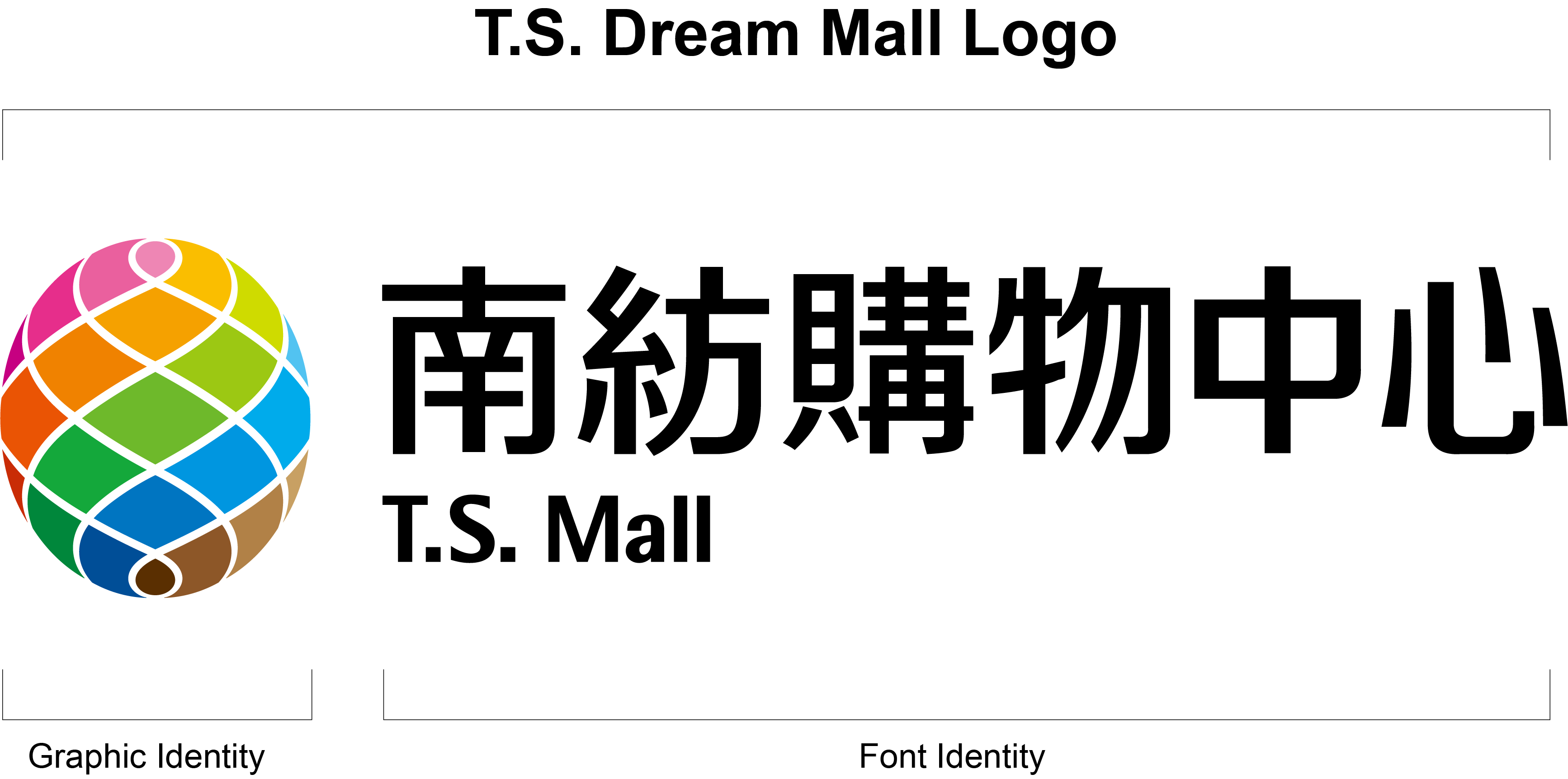
The of the graphic design integrated the following three themes:
The “Spinning” Theme:The graphic image of spinning symbolizes the corporate philosophies of “Honesty and Integrity”, “Diligent and Pragmatic” and “Sincere and Fair” that contribute to the success of textile businesses and the long-term accumulation of achievements which will be passed down to T.S. Dream Mall. The image of the eternal cyclic spinning yarn is a visualization of the profound friendship between our faithful customers as well as the connection of new customers visiting the Mall in the near future.
The “Fruit” Theme:The image of fresh, juicy fruit symbolizes the bountiful and successful future of the Mall. It is expected that all kinds of leisure and shopping spaces will help shape a new landmark for the greater Tainan area and be endorsed by a huge population of customers as it becomes the hub for development in the region and for gathering the achievements of textile businesses around Tainan.
The “Five Elements” Theme:The five colors found in the logo indicate the “five elements” of the philosophy of nature. They are used to highlight the features of spatial design of T.S. Dream Mall in valuing environmental harmony and natural cycles. The five intertwined colors display the versatility and recreational character of the shopping spaces at T.S. Dream Mall, which leads the cutting edge and satisfies customers’ needs with the on-going spirit of pursuing progress.
Font Identity Design Concept
The design of the font aims to create the images of “Trust”, “Quality” and “Kindness” for the customers of T.S. Dream Mall. It was combined with clean, elegant lines for word shapes which can be clearly identified and easily applied to either the large sign on the façade of buildings or the pages of publications.